For the past three years, East Bay Community Foundation (EBCF) faced a significant design challenge. In 2019, the 94-year-old philanthropic institution was named “the boldest community foundation” by Inside Philanthropy, yet its visual brand was “painfully outdated,” as one staff member wrote at the time. How might EBCF evolve our visual identity to rise to its vision and commitment to social and racial justice?
In 2019, EBCF leaders recognized growing inequities in the Bay Area despite the collective philanthropic accomplishments and the great generosity of our partners. To reach beyond the traditional charity model and grow into a “change catalyst,” EBCF’s board of directors approved a new mission statement: “To partner with donors, social movements, and the community to eliminate structural barriers, advance racial equity, and transform political, social, and economic outcomes for all who call the East Bay home.” Guided by our new mission, EBCF has redirected our discretionary grantmaking to create opportunities for movement leaders and to lobby for grassroots campaigns, realigned our philanthropic investments with social justice values, and convened organizations, businesses, institutions, and individuals to partner in this work. In partnership with our stakeholders, we hoped to achieve our vision of an inclusive, fair, and just East Bay.
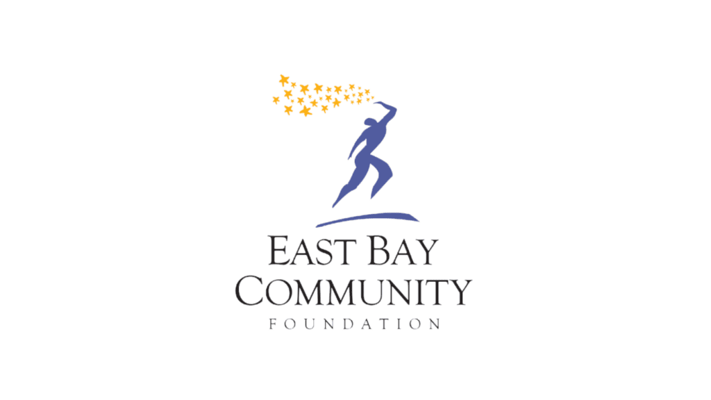
Meanwhile, as EBCF spearheaded innovation in philanthropy, our website and visual identity had not kept pace with the organization we were becoming and the vibrance of our local communities. Our logo featuring a dancing figure below a cascade of stars had been fittingly designed for an organization focused on economic development and support for children, but our mission had grown in scope.
After a comprehensive request for proposal process, our marketing & communications team at the time enlisted the services of Vermilion, a design firm with 40 years of experience in visual identity development and website design.
The new visual identity needed to reflect the organization EBCF had become, while demonstrating our sustained commitment to serving as the philanthropic home for all that are interested in supporting the needs of our region.
Today, we are excited to introduce our new brand identity and website, which more accurately represents our bold commitment to our community and addressing the systemic barriers to advancing A Just East Bay.
With its simple geometric shapes and containers, a modern color palette, and a clean typography, our new visual identity places the vibrancy of our organization and the communities we serve front and center.
Jessica Hakanson from Vermillion describes it this way: “The East Bay’s bold civic pride and confidence was the driving inspiration behind the brand’s new modern, pioneering, and memorable visual identity. It builds on the East Bay Community Foundation’s existing brand equity while better capturing their commitment to racial justice and shift to become more than a traditional philanthropic services organization.”
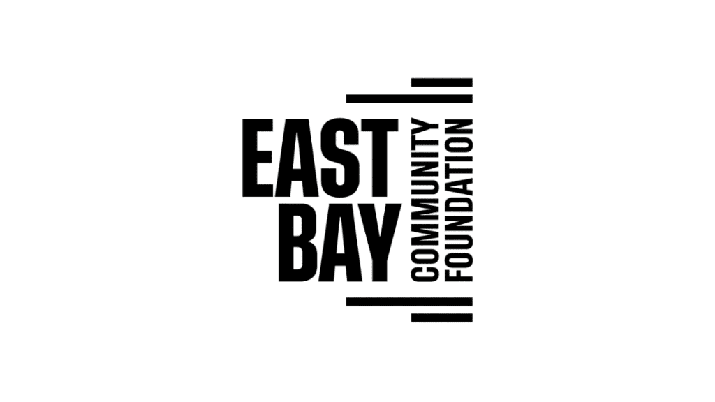
The centerpiece of the new brand identity is our new logo. Initially, the team at Vermilion, guided by feedback from our stakeholders, explored a variety of logo options in layout, font, and color. Our new, strong black logo evokes a new modern look that maintains a sense of trust and credibility.

Color is an essential component of any brand. Modern colors in our palette represent the vibrancy and diversity of the East Bay while evoking feelings of creativity, trust, confidence, healing, and security.
The right alignment of the text is meant to be a subtle nod to the “East” Bay, and the logo’s boldness denotes the seriousness of our commitment to the people we represent. The stacked line accents at the top and bottom convey motion and transformation – a visual representation of our effort to eliminate structural barriers, advance racial equity, and transform political, social, and economic outcomes for all who call the East Bay home.
Another important element of our new brand identity is photography. EBCF has been fortunate to receive the rights to use photography created by local activist and photographer Brooke Anderson. Brooke’s work in the community features the people and the environment that make the East Bay a special place. In fact, many of these images come from events featuring EBCF’s core grantees and other movement leaders. These photos are used with permission from leaders of those organizations. We are grateful to Brooke and to all the movement leaders who are building an inclusive, fair and Just East Bay.
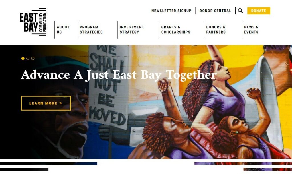
We are also excited to announce the launch of our new streamlined website. We invite you to dive into the new “About Us” section which explores our history, mission, and financials, and introduces you to our staff and board of directors. Visitors to the site can also learn more about the four core program strategies that underpin everything we do and gain more insight into our investment strategy which outlines opportunities to align our investments and create social impact by directly supporting women and BIPOC entrepreneurs and business owners.
If you have questions about our new visual identity, please get in touch with us. We’d love to hear from you.